


Image Ticker Carousel by Creavi is a free WordPress plugin for Elementor that combines a continuous image ticker, a step carousel and a cross-fade slider in one widget. You can display client logos, artwork, product images or promotional cards, then choose how visitors move through them. Elementor Pro is not required.
The name starts with “ticker,” but a scrolling logo strip is only one way to use it. Add images, titles, subtitles, badges and destination links directly in Elementor. Use a flowing row for recognition, a carousel for browsing, or a single-image slider when one message deserves the space.
Explore Image Ticker Carousel and the live examples, or get the free plugin on WordPress.org.
Ticker, carousel or slider: which should you use?
The three movement styles serve different kinds of content. Choose the one that gives visitors enough time to understand what they are seeing.
| Movement style | How it works | Useful for |
|---|---|---|
| Continuous ticker | Images move along a horizontal row. | Client logos, partners, sponsors and short visual highlights. |
| Step carousel | The row advances one item at a time, with optional navigation arrows. | Artwork, portfolio cards and product images with captions. |
| Cross-fade slider | One item fades into the next, with optional navigation arrows. | Featured artwork, announcements and focused promotional messages. |
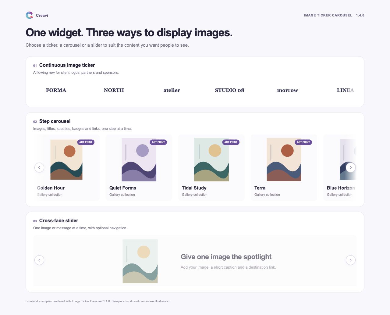
For a logo strip, continuous movement can keep a collection visible without asking visitors to click. When the content includes titles or descriptions, the step carousel offers a clearer browsing rhythm. A cross-fade slider suits a smaller selection where each image needs individual attention.
Build clickable cards, not only rows of images
Each item can contain an image, title, subtitle, badge and link. A linked item is clickable as a whole, so a visitor can move from a project preview to its case study, or from a product image to a product page.
For example, a studio could add project artwork with a short title and a link to the full portfolio entry. A shop could add selected product images, type a price or offer into the subtitle, and link each card to the relevant page. These items are added manually in Elementor; you control the wording and destination.
You can also create text-only items or mix images and text. Adjust typography, card backgrounds, spacing, padding, corner radius and image dimensions to fit the surrounding page.
Add an optional 3D oval curve
Version 1.4.0 adds 3D Oval Curve for multi-item tickers and carousels. The center stays prominent while items toward the edges rise, turn and recede along an oval. Images, captions, badges and links move together.
Choose Content → Layout & Effects → Item Layout → 3D Oval Curve. Then open Style → Curved Layout to adjust curve height, edge scale and edge turn.
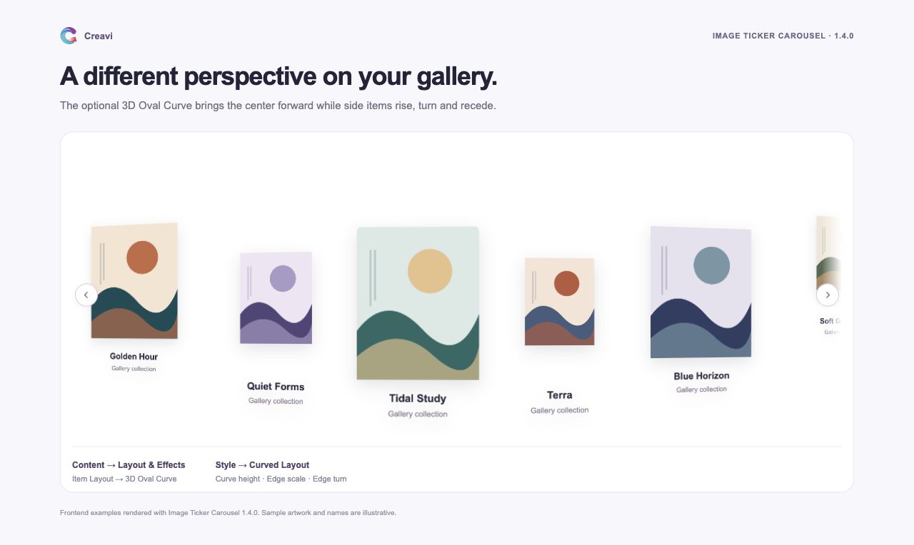
The straight layout remains the default. The curve needs at least three usable items and enough space for two of the widest item slots. Narrow layouts, cross-fade sliders and reduced-motion preferences use a straight layout.
Load suitable image sizes while keeping the original artwork
A small image on the page does not always need the full original file. Version 1.4.0 adds WordPress responsive image sources and native lazy loading for eligible Media Library images.
With Responsive Images enabled, the browser can choose an existing WordPress image size that suits the image’s displayed width and the screen’s resolution. The plugin offers sources with matching proportions, so portrait and landscape artwork can retain their individual shapes. Original files are never modified or regenerated.
Lazy loading lets the browser defer eligible offscreen images while the starting image loads eagerly. Browsers may preload nearby carousel images, so the benefit depends on the layout and how close the images are to the visible area.
Both settings are enabled by default under Content → Image Loading. Responsive loading needs a saved Media Library attachment ID, suitable existing image sizes and a pixel-based width or height constraint. Percentage-based sizing, fully unconstrained natural dimensions and URL-only images keep their compatible fallback behavior. The plugin does not create WebP files or generate missing thumbnails.
Adjust the layout for desktop, tablet and mobile
Use Elementor’s responsive controls to set dimensions, spacing and typography for the available space. A wide portfolio row might show several cards on a desktop, while a narrower layout gives each image more room on a phone.
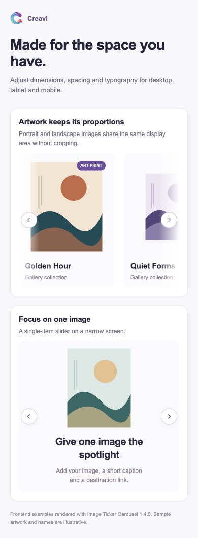
Optional previous and next arrows support carousel and cross-fade layouts. Pause on hover or focus gives visitors time to inspect an item. Side fades are available for supported ticker and multi-item carousel layouts, and the plugin respects reduced-motion preferences.
How to create an Elementor image carousel
- Install and activate Image Ticker Carousel and Elementor.
- Edit a page with Elementor and search for Creavi Image Ticker Scroll.
- Add the widget and enter your images, titles, subtitles, badges and links under Content → Items & Links.
- Open Movement & Timing and choose Ticker — Continuous Scroll, Carousel — Slide by Slide or Slider — Cross-fade.
- Adjust image dimensions, card styling, spacing and timing. Enable navigation or the optional curve when it suits the layout.
- Preview the page on desktop and mobile, test the item links and publish the page when it is ready.
If you are updating an existing installation, check that you have version 1.4.0 or later for the curve and image-loading options. After an update, clear page and asset caches before reviewing the result.
Frequently asked questions
Is Image Ticker Carousel free, and does it need Elementor Pro?
The plugin is free on WordPress.org and works with Elementor Free. Elementor Pro is not required.
Can I use it for product images or portfolio projects?
Yes. Add the images, captions and links manually in Elementor. For product cards, you can type a price or short offer into the subtitle and link the item to its product page.
Do all carousel images need the same proportions?
No. Portrait, landscape and square images can keep their individual proportions within the display dimensions you choose. Responsive image sources use matching proportions where suitable WordPress sizes exist.
Does lazy loading mean every hidden slide waits to download?
No. Native lazy loading is controlled by the browser, which may fetch nearby images before they become visible. Responsive image selection can still reduce the file size used for eligible images.
Can the 3D oval curve be used with a cross-fade slider?
The curve is designed for multi-item tickers and step carousels. The cross-fade slider uses a straight layout with one item visible at a time.
Choose how your images tell the story
Use a ticker for a flowing collection, a carousel for browsing, or a slider for one focused image. Start with the content you want to show, then choose the movement and styling that fit your page.
See Image Ticker Carousel examples · Download the free plugin